TabTouch App Redesign
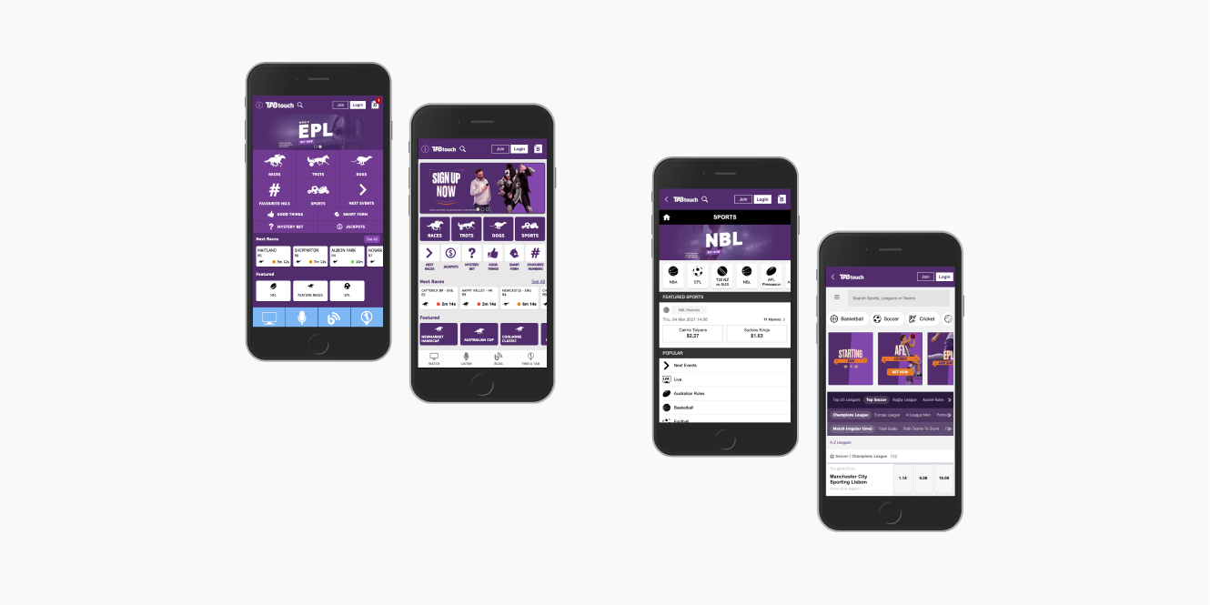
Complete UI overhaul of TabTouch's mobile betting app, aligning with a new branding campaign and modernising the user experience.
The Challenge
The existing TabTouch mobile app hadn't been updated in years and lacked visual appeal and user-friendliness compared to competitors. It needed modernisation to reflect the new branding campaign while meeting current user expectations in the Australian betting market.
The Solution
Conducted comprehensive UI audits and competitive analysis to identify improvement areas. Key design decisions included:
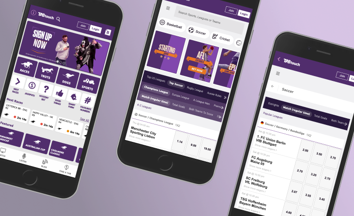
- Integrating Kambi's design system for seamless sports data display
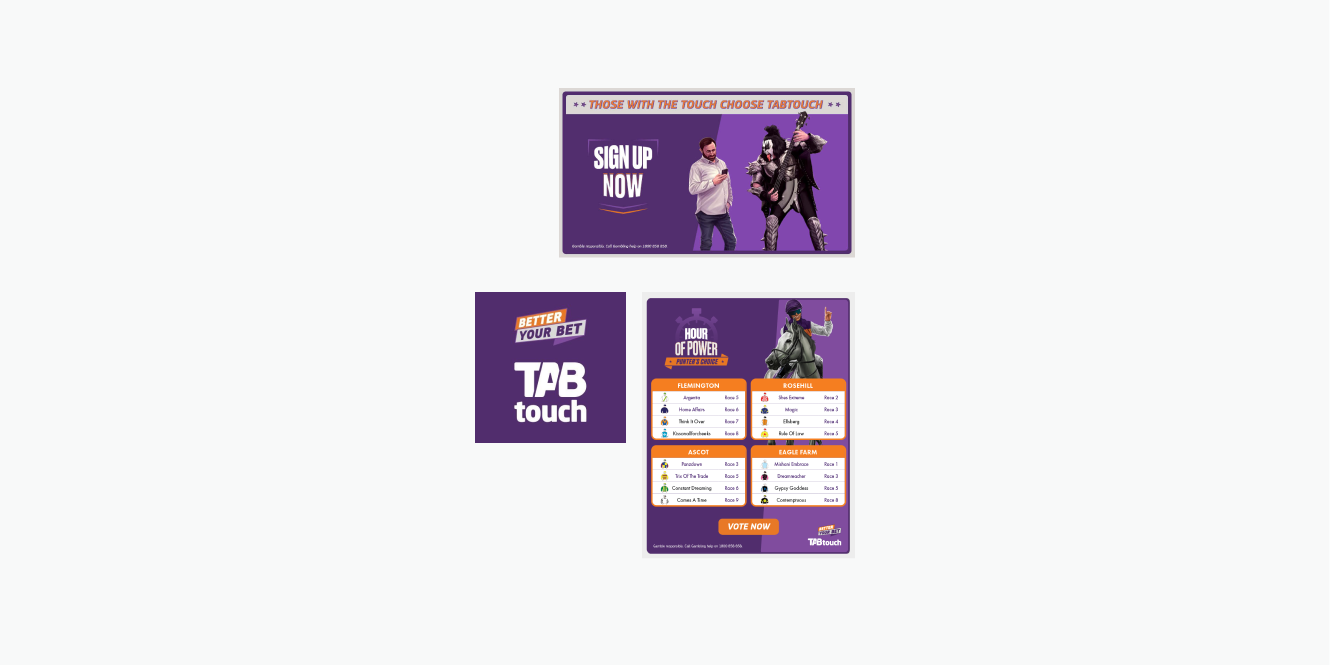
- Applying bold purple and orange branding with Material Design principles
- Implementing minimalist iconography with improved visual hierarchy
- Adding a carousel for major sporting events and redesigned event cards
Design & Development
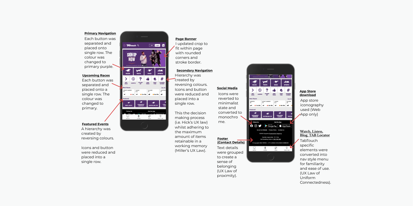
- Created wireframes ensuring intuitive navigation and clear visual hierarchy across main navigation, upcoming races, featured events, and live content
- Applied Material Design principles with rounded borders and streamlined icons
- Typography and iconography were simplified to a monochrome style for legibility
- Text grouped using the Law of Proximity for cohesive layouts
- Primary purple was used for call-to-action buttons to establish clear hierarchy
Outcome & Reflections
The redesign successfully modernised TabTouch's interface with overwhelmingly positive user feedback. The visual improvements streamlined user flow, increased competitiveness, enhanced engagement with betting features, and reinforced brand cohesion across platforms.